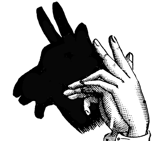
Out of the shadows
Disclaimer - This article discusses topics which are not cemented yet, may change and likely won't work without browser shims / hacks. This article uses <"shadow-tree"></> syntax like the CSS specification does to demarcate the shadow tree in the DOM.
So we have all likely heard of web components by now; they are usable in most JavaScript libraries and are the UI kit that is expected of any GUI related software.
However one of the least discussed features of web components is the Shadow DOM and even less discussed is how it can be styled with scoped styles.
Shadow DOM is the way in which developers will be able to hide away the minor details of website implementation, this means that template authors won't need to worry as much about perfecting their markup and concentrate on the building block they are trying to make. A great example of this is select boxes native in browsers, content authors don't need to worry about all the complexities of the buttons and functionality. The author can then just give some basic styling to the select box.
So I hear you cry, why is this different to normal components that give us the ability to define our own web language and reuse. Well I think it solves the issue of specificity - by defining the boundaries of reusable objects, you gain the ability to isolate styles when necessary.
Before DOM render
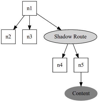
Elements are nested under the Shadow host n1.
After DOM render
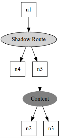
Once rendered, elements that are not a Shadow route are nested under the DOM insertion point <content>
<my-element><!-- Shadow host -->
  <"shadow-tree"><!-- A non element -->
    <div class="title">Some text</div>
    <!-- CSS inside a shadow DOM is treated as scoped -->
    <style>
      //my-element won't match anything here, use :host instead
      my-element {
        color: red;
      }
      //:host selector here will match my-element
      :host {
        color: blue;
      }
    </style>
  </>
</my-element>

<style>
  //Matches .title element
  my-element::shadow div {
    color: red;
  }
  //Applies to the content div elements
  //not ones residing in the shadow DOM .title would not match
  my-element div {
    color: red;
  }
</style>
So why does it matter to me?
- Shadow DOM provides a encapsulation layer that means multiple teams can work on the same HTML documents without worries of colliding CSS.
- Flexibility still remains to "select through the shadows" so you can override the default appearance of a component.
- Content authors can concentrate on styling usage rather than implementation.
- Component developers can concentrate on building the most reusable components possible.
- No amount of namespacing gives the isolation that Shadow DOM gives.
- Nested HTML that is namespaced still has specificity issues, where as isolation gives easier container selection.
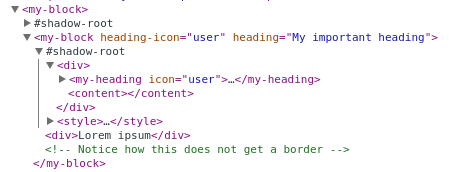
Chrome debugger even helps show the DOM tree:
Shadow DOM concepts
- Shadow host - is the container of one or many Shadow trees
- Elements within the Shadow host are detached until they match a DOM insertion point
- The last Shadow tree inserted into the Shadow host is the only attached Node to the host.
- Older Shadow trees can be inserted into the newest shadow tree with a Shadow insertion point
- Shadow insertion point When a host has multiple Shadow trees the trees can be reinserted into the newest tree if it has an insertion point.
<shadow>is the current only implementation of a Shadow insertion point
- DOM insertion point - At the moment this is a
<content>tag within the shadow DOM however other implementations may happen- An insertion point has the elements placed into it inside the Shadow tree
- Insertion points has no representation in the DOM, it is just a container for elements.
- Insertion points match the elements in the Shadow host
- Shadow trees - A tree of elements which are abstracted away from the normal DOM tree
- Shadow trees detach all elements from the Shadow host
A simpler implementation (The design)
However we can vastly simplify this for the most common usage with custom elements;
- Create a new custom element
- A Shadow tree is added to the custom element (Making the custom element a shadow host)
- A template of DOM nodes is cloned and inserted into the Shadow tree
- Elements that are contained in the custom element are either detached from the DOM
- Or if the template has a
<content>tag the elements are inserted within that.
- Or if the template has a
Assuming we have some code building the custom elements (see final example), the following code:
<template id="mycustomelement">
  <div>
    <content></content>
  </div>
</template>

<my-custom-element>
  <b>Hello</b>
</my-custom-element>
Will result in the following DOM tree:
<my-custom-element>
  <div>
    <b>Hello</b>
  </div>
</my-custom-element>
JavaScript implementation
Registering a component
Registering a new component is our first step to getting to the design set out above.
Let's register a new component called product-demo and register it to the global window.productDemo.
//Create a custom element that extends from the base HTMLElement
var productDemoPrototype = Object.create(HTMLElement.prototype);

//Register the element name to the window
window.productDemo = document.registerElement('product-demo', {prototype: productDemoPrototype});
We can use the element before we define it in the JavaScript as HTML5 allows for custom elements that are not defined yet. However if we define custom behaviour to the window.productDemo once the element is created this behaviour get applied to the element.
Customising the new element becomes simple with the new method createdCallback on the defined element. The callback is triggered when a new element instance is created, this gives us the ability to add custom behaviour on initialisation.
window.productDemo.createdCallback = function () {
  console.log('New product-demo created');
};
Attaching a template
Web Components doesn't require us to use <template> tags however they make writing the innards of a shadow simpler by being in a self contained placeholder.
<template>
  <h2>Product name</h2>
  <div>
  </div>
</template>
Templates are just a simple blueprint for DOM nodes that have to be cloned to be inserted into the DOM:
var template = document.querySelector(templateSelector);
var clone = document.importNode(template.content, true);
document.body.appendChild(clone);
The problem with this is that however complex the template, there is nothing dynamic to the component yet. However later on we will see that we use the createdCallback to add in functionality from passed attributes to our custom elements.
Adding a shadow DOM
Element.createShadowRoot creates a shadow root on the element.
Element.createShadowRoot();
By adding this to an element it turns the element into a shadow host which in terms of JavaScript is similar to document.createDocumentFragment in that it isn't a real element in the conventional sense.
Scoping CSS
Scoped styles are the main advantage to Shadow DOM in that the selectors exposed allow web component developers to be able to 'black box' their code appearance unless the user of the component explicitly wanted to style within the component.
Styles within the shadow DOM are scoped to the Shadow root rather than document wide as they normally would be.
Styles from the outside of the shadow are unable to select into the shadow unless using the selectors defined below. This means that as a template author I can't select by mistake the innards of the shadow which means the components become very self contained. Rules like color will be inherited into the shadow unless the shadow defines its own rules for those properties which would take a higher specificity.
//This has a shadow DOM applied
my-component {
  color: red;
}

//This matches all elements which are:  "my-component <"shadow tree"> <content> span"
//This won't match span elements within the shadow tree
my-component span {
  color: blue;
}
CSS Scoping specification defines ways in which we can utilise CSS to get over those age old specificity woes.
The spec brings along some new friends which will really be useful for working with shadow DOM:
Selectors from the outside
::shadow
::shadow can be used to override the components styles within the shadow DOM allowing you to pierce through the shadow and pick out elements within it.
>>>
>>> deep shadow selector, through multiple layers of shadow DOM. This selects all the matching elements through the shadow including DOM insertion point content also.
Chrome doesn't even support this selector yet, /deep/ was in the older version of the specification and is the current implemented version in Chrome unstable.
:unresolved (part of the web component specification)
:unresolved can be used to target elements that have not yet been registered by the JavaScript. As all new web components are not native in the browser, until the elements are defined then the browsers considers web-component tags as 'unresolved' when the element is defined then the flag is removed from those elements. This means that the CSS author has full control of the behaviour of an element until the element is defined.
For example the author could pick to hide the elements or show a loading spinner.
//Before my-custom-component is defined this will be the default appearance
//This prevents any flash of unstyled component
my-custom-component:unresolved {
  display: none;
}
Selectors from the inside
These selectors are for use within the Shadow DOM to select into the <content> element or matching certain Shadow host elements.
::content
::content is used to select the elements residing in the DOM insertion point. Used from within the shadow to select matching elements within the DOM insertion point.
::content for me is important in that it helps us define relationships between other components:
//product-demo.css
::content product-image {
  display: block;
  float: right;
}
::content product-description {
  display: block;
  float: left;
}
:host()
Used from within a Shadow DOM to select the Shadow host that matches the selector within the brackets.
:host(.big) // From the styles within a shadow root this matches host elements that have an ancestor which match '.big'
:host
:host is used for selecting the shadow host element from within the shadow DOM itself.
:host-context()
:host-context is used to select the parents of the host element from within the shadow context.
Putting it all into action
Here is a simple function I made to define new elements with a shadow DOM.
/**
 * Create callback
 * @callback createElementCallback
 * @param {element} shadow the shadow DOM element
 * @param {scope} this the scope of the custom element
 */

/**
 * Generates a new component
 * @param {string} elementName Name of JavaScript Class for the element
 * @param {string} tagName Name of the tag produced (Must contain at least one '-')
 * @param {string} templateSelector Selector to template for the contents of the shadow DOM
 * @param {createElementCallback} postCreateCallback Callback triggered on construction of the element
 */
function generateComponent(elementName, tagName, templateSelector, postCreateCallback) {

  //Create a custom element that extends from the base HTMLElement
  var elementPrototype = Object.create(HTMLElement.prototype);

  //On creation of an element this code triggers
  //Defines a shadow root within our custom element
  //Imports in the matching template
  //Triggers the callback for any further customisation
  elementPrototype.createdCallback = function() {
    var shadow = this.createShadowRoot();
    var template = document.querySelector(templateSelector);
    var clone = document.importNode(template.content, true);
    shadow.appendChild(clone);
    if (postCreateCallback) { postCreateCallback(shadow, this); }
  };

  //Register the element name to the window
  window[elementName] = document.registerElement(tagName, {prototype: elementPrototype});
}
This sets up a new component which has a shadow DOM within it, the template specified will be inserted into shadow DOM which the function also sets up.
<my-element>
  <"Shadow tree">
    Template nodes here
  </>
</my-element>
Example
Define some elements
function slugify(slug) {
  return slug.toLowerCase().replace(/\s/g,'-');
}

generateComponent('MyBlockElement', 'my-block', '#myblocktemplate', function (shadow, scope) {
  var headingDOM = shadow.querySelector('my-heading');
  var heading = scope.getAttribute('heading');
  var icon = scope.getAttribute('heading-icon');
  if (headingDOM) {
    if (heading) {
      headingDOM.innerText = heading;
    } else {
      headingDOM.style.display = 'none';
    }
    if (icon) {
      headingDOM.setAttribute('icon', icon);
    }
  }
});

generateComponent('MyHeadingElement', 'my-heading', '#myheadingtemplate', function (shadow, scope) {
  var icon = scope.getAttribute('icon');
  var iconDOM = shadow.querySelector('i');
  var linkDOM = shadow.querySelector('a');
  if (icon && iconDOM) {
    iconDOM.classList.add(icon);
  }
  if (linkDOM && scope.innerText !== '') {
      linkDOM.setAttribute('href', '#' + slugify(scope.innerText));
  }
});
Define the component templates:
<template id="myheadingtemplate">
  <div>
    <i class="icon"></i>
    <h1>
      <content></content>
    </h1>
    <a href="#" >#</a>
  </div>
  <style>
      i.icon:before {font-size:30px;}
      i.user:before {content: '☻';}
      i.pentagon:before {content: '⬟';}
      h1 {display: inline-block;}
  </style>
</template>

<template id="myblocktemplate">
  <div>
    <my-heading></my-heading>
    <content></content>
  </div>
  <style>
     div {
       border: 1px solid #000;
       padding: 5%;
       margin-bottom: 5%;
     }
  </style>
</template>
WHAT!? I hear you cry, nested
<style>tags within my component template? For now this is the simplest implementation for component scoped styles however rolling a custom<importfrom separate assets later would be advised. However the idea is that most components should be kept small so who knows this may become the common form as practices evolve.
Our actual template using the elements:
<my-block>
  <my-block heading-icon="user" heading="My important heading" >
    <div>Lorem ipsum</div>
  </my-block>

  <my-block heading-icon="pentagon" heading="My second heading" >
    Lorem ipsum
  </my-block>
</my-block>
It is worth noting the same effect could be achieved with the same CSS outside the templates:
my-heading::shadow div {
 border: 1px solid #000;
 padding: 5%;
 margin-bottom: 5%;
}
my-block::shadow i.icon:before {font-size:30px;}
my-block::shadow i.user:before {content: '☻';}
my-block::shadow i.pentagon:before {content: '⬟';}
my-block::shadow h1 {display: inline-block;}
Which is lengthier however there are a few solutions to this:
- Use LESS or Sass
- Use HTML imports to push the CSS into the element whilst still maintaining a separate CSS file
- Drawback is Mozilla won't be implementing import just yet
- Use a shim to compile together the CSS, JS and HTML into a package similar to how other frameworks do for components now
- Shim support for nested CSS
Further reading
- Pollyfills
- Styling with polymer
- Good practices with web components
- Polymer in Ember-cli
- Shadow DOM CSS cheat sheet - also has examples using polymer