Making a dynamic palette today
Creating dynamic CSS doesn't sound exciting, however it is certainly a time management issue of large scale sites on the web. This has lead to the advancement of preprocessing CSS and other methodologies like OOCSS and SMACSS which bring their own issues too.
All these solutions really miss out from being a scalable system that will work in the browsers of tomorrow. The color CSS specification and CSS variables specification changes all that, along with using a preprocessor called Myth we can give tomorrows browser support to todays browsers.
Showcasing a sample palette
CSS3 code:
:root {
  --primary: #e7e371;

  --analog: color(var(--primary) hue(+30%));
  --sixty: color(var(--primary) hue(+60%));
  --right-triangle: color(var(--primary) hue(+90%));
  --triad: color(var(--primary) hue(+120%));
  --split-complement: color(var(--primary) hue(+150%));
  --complement: color(var(--primary) hue(+180%));
  --split-complement-negative: color(var(--primary) hue(-150%));
  --triad-negative: color(var(--primary) hue(-120%));
  --right-triangle-negative: color(var(--primary) hue(-90%));
  --sixty-negative: color(var(--primary) hue(-60%));
  --analog-negative: color(var(--primary) hue(-30%));
}

* {
  font-family: arial;
}

.palette {
  max-width: 600px;
  margin-top: 2em;
}

.palette > div {
  height: 100px;
  width: 100px;
  float: left;
  font-size: 12px;
  display: flex;
  justify-content: center;
  align-items: center;
  text-align: center;
}

.primary {
  background-color: var(--primary);
}

.complement {
  background-color: var(--complement);
}

.analog {
  background-color: var(--analog);
}

.analog-negative {
  background-color: var(--analog-negative);
}

.split-complementary {
  background-color: var(--split-complement);
}

.split-complementary-negative {
  background-color: var(--split-complement-negative);
}

.triad {
  background-color: var(--triad);
}

.triad-negative {
  background-color: var(--triad-negative);
}

.right-triangle {
  background-color: var(--right-triangle);
}

.right-triangle-negative {
  background-color: var(--right-triangle-negative);
}

.sixty {
  background-color: var(--sixty);
}

.sixty-negative {
  background-color: var(--sixty-negative);
}
Myth then outputs CSS 2.0 output with other browser prefixes:
* {
  font-family: arial;
}

.palette {
  max-width: 600px;
  margin-top: 2em;
}

.palette > div {
  height: 100px;
  width: 100px;
  float: left;
  font-size: 12px;
  display: -webkit-box;
  display: -webkit-flex;
  display: -ms-flexbox;
  display: flex;
  -webkit-box-pack: center;
  -webkit-justify-content: center;
  -ms-flex-pack: center;
  justify-content: center;
  -webkit-box-align: center;
  -webkit-align-items: center;
  -ms-flex-align: center;
  align-items: center;
  text-align: center;
}

.primary {
  background-color: #e7e371;
}

.complement {
  background-color: rgb(111, 115, 231);
}

.analog {
  background-color: rgb(175, 231, 111);
}

.analog-negative {
  background-color: rgb(231, 167, 111);
}

.split-complementary {
  background-color: rgb(111, 175, 231);
}

.split-complementary-negative {
  background-color: rgb(167, 111, 231);
}

.triad {
  background-color: rgb(111, 231, 227);
}

.triad-negative {
  background-color: rgb(227, 111, 231);
}

.right-triangle {
  background-color: rgb(111, 231, 167);
}

.right-triangle-negative {
  background-color: rgb(231, 111, 175);
}

.sixty {
  background-color: rgb(115, 231, 111);
}

.sixty-negative {
  background-color: rgb(231, 111, 115);
}
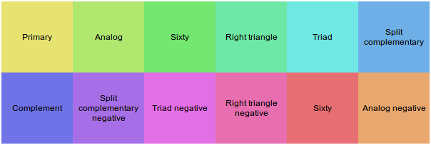
With a sample HTML page like this:
<section class="palette">
  <div class="primary">Primary</div>

  <div class="analog">Analog</div>

  <div class="sixty">Sixty</div>

  <div class="right-triangle">Right triangle</div>

  <div class="triad">Triad</div>

  <div class="split-complementary">Split complementary</div>

  <div class="complement">Complement</div>

  <div class="split-complementary-negative">Split complementary negative</div>

  <div class="triad-negative">Triad negative</div>


  <div class="right-triangle-negative">Right triangle negative</div>

  <div class="sixty-negative">Sixty</div>

  <div class="analog-negative">Analog negative</div>
</section>
This will then output something that looks like:
Example usage
I was going to show example uses here I had made using the above methods, but instead here are some great effects in CSS that could use the above to become a lot more flexible and lightweight.
All of the above would benefit from using variables and dynamically creating colours. As more animations become commonplace with other advanced layout techniques, using tools to generate more of the work will help your CSS be more maintainable.
The future

What this gives us is a dynamic StyleSheet that matches the functionality of the features of LESS and SASS today. It also gives the flexibility to later have native support in the browser with compliant code. With the mention of an upcoming API which could be leveraged in JavaScript or CSS animations really could make using CSS variables a lot more exciting. The final resting place for the CSS variables API will likely be part of the CSS extensions specification where many other future adaptions will lie.